Expert Bedroom Color Ideas: Create Your Dream Sanctuary
Ready for a serene space? Explore expert bedroom color ideas to design a personal sanctuary that truly resonates with you. Start transforming your room today!
By Lena Ashford / Writer, Roomellow
When it comes to designing a bedroom, I often hear people get hung up on furniture layout or finding the perfect bed frame, which are certainly important. But what truly sets the tone, the mood, and the very feeling of your space is color. It's the silent communicator, telling your brain whether to relax, energize, or simply exist in comfort. And in a bedroom, comfort and calm are non-negotiable.
Choosing the right colors for your bedroom isn't about following fleeting trends; it's about crafting a personal retreat that genuinely resonates with you. It’s about understanding how light plays, how different hues impact your psyche, and how to build a cohesive palette that feels both intentional and effortless. Forget the idea that a bedroom has to be "boring neutral" to be calming. I’m here to tell you that with a little strategy, even bold colors can create a serene atmosphere.
Start with Intention: What Mood Do You Crave?
Before you even think about swatches, close your eyes and imagine how you want to feel when you walk into your bedroom. Do you want it to be a cozy, enveloping cocoon? A bright, airy sanctuary? A dramatic, luxurious escape? Your answer to this question is the North Star for your color journey.
For example, if "cozy and enveloping" is the goal, you might lean towards richer, deeper tones. If "bright and airy" calls to you, soft pastels or crisp whites with subtle undertones will be your friend. This isn't just about aesthetics; it's about designing for your well-being. Once you have a mood in mind, the color choices start to become much clearer. For more general advice on creating your ideal space, check out our guide on Unlock Your Dream Retreat: Essential Bedroom Ideas & Design Tips.
Mastering Wall Colors: Your Canvas
The walls are the largest surface area in your bedroom, making them the biggest color commitment. This is where most people start, and for good reason.
1. The Power of Sophisticated Neutrals
Let's debunk the myth that neutrals are boring. The right neutral is anything but. It’s a sophisticated backdrop that allows other elements in your room to shine, creating a sense of calm and spaciousness.
- Warm Whites & Off-Whites: These are not all created equal. A true warm white will have a subtle yellow or cream undertone, which prevents it from feeling stark or cold. Think Farrow & Ball's "Wimborne White" or Sherwin-Williams' "Alabaster." They bounce light beautifully and create an airy, welcoming feel without being too sterile. I often recommend pairing warm whites with natural wood tones like oak or walnut for an organic, inviting look.
- Soft Greiges & Taupes: These are the chameleon colors, blending grey and beige to create a wonderfully versatile tone. They add more depth than a pure white but still keep things light. Benjamin Moore's "Revere Pewter" is a classic for a reason; it reads differently depending on the light, sometimes more grey, sometimes more beige. The trick is to sample them in your actual room, watching how they behave throughout the day. A greige with a slight green undertone can feel particularly grounding and natural.
- Light, Muted Greys: If you're going for a modern or Scandinavian aesthetic, a soft, muted grey can be incredibly chic. Avoid anything too cold or blue-toned unless you specifically want a crisp, almost icy feel. Look for greys with subtle purple or brown undertones to add warmth. A pale, almost lavender-grey can be incredibly soothing and sophisticated.
Trade-off: While neutrals offer versatility and a serene backdrop, they require careful layering of textures and varied tones in your furniture and decor to prevent the room from feeling flat. This is where a textured rug, a patterned throw, or an interesting piece of art becomes even more vital.
2. Embracing Deep, Moody Hues
If your mood calls for "cozy cocoon," then deep, saturated colors might be your answer. Don't shy away from them, even in smaller bedrooms!
- Deep Blues: From navy to inky blues, these colors evoke tranquility and sophistication. They are surprisingly versatile and pair beautifully with warm woods, brass accents, and crisp white bedding. A deep blue wall, like Benjamin Moore's "Hale Navy" or Sherwin-Williams' "Naval," can make a room feel expansive and infinitely restful. It absorbs light, creating a cave-like coziness perfect for sleep.
- Rich Greens: Sage, forest green, or even an earthy olive can bring the calm of nature indoors. Greens are incredibly grounding and are fantastic for creating a sophisticated, organic feel. Consider Farrow & Ball's "Green Smoke" for a vintage-inspired look, or a darker forest green for something more dramatic.
- Charcoal or Black: Yes, black can work in a bedroom! When done right, a charcoal or true black wall creates unparalleled drama and intimacy. It’s bold, but it can be incredibly chic and modern. The key here is balance: ensure you have plenty of natural light, reflective surfaces (like a large mirror or metallic accents), and lighter textiles to prevent it from feeling oppressive. This is for the brave, but the payoff in terms of style and coziness can be huge.
Trade-off: Deep colors can make a small room feel smaller if not balanced correctly. You’ll need to ensure ample lighting (both natural and artificial), lighter bedding, and perhaps a large mirror to reflect light and visually expand the space. Paint costs are the same, but you might need an extra coat for full coverage.
3. The Gentle Touch of Pastels
Soft, desaturated colors offer a delicate approach to a calming bedroom.
- Muted Blues & Greens: These are classic choices for a serene bedroom. Think soft sky blues, robin's egg hues, or dusty mints. They have a calming effect and often feel fresh and airy. Pairing them with creamy whites and light wood tones creates a breezy, coastal vibe (for more on this, explore Coastal Interior Design: Transform Any Room into a Sanctuary).
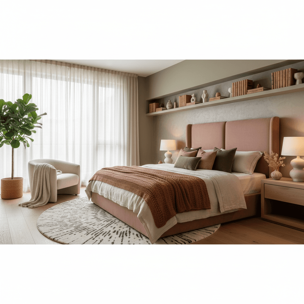
- Dusty Rose & Lavender: For a touch of subtle warmth and femininity, a dusty rose or a pale, almost greyed-out lavender can be incredibly beautiful. These aren't overly saccharine pinks but sophisticated, muted versions that add a gentle softness. They work well with natural textures, brass, and even deeper jewel tones as accents.
Trade-off: Overly bright or sugary pastels can feel childish rather than sophisticated. The key is to choose muted, desaturated versions with grey undertones to keep them feeling mature and calming.
Layering Color Through Textiles: The Soft Furnishings
Once your walls are sorted, the next biggest opportunity for color comes from your textiles. These are less permanent than paint, making them excellent for experimenting or updating your look seasonally.
1. Bedding: The Heart of the Room
Your bedding is arguably the most important textile in your bedroom. It takes up a huge visual footprint and significantly contributes to the room's color story.
- The Duvet Cover/Comforter: This is your primary color anchor. If your walls are neutral, you can go bolder here with a rich color like a deep forest green velvet duvet, a terracotta linen set, or even a subtle stripe or pattern. If your walls are already a strong color, opt for lighter, complementary tones – crisp white, a muted grey, or a soft cream.
- Sheets: I always advocate for high-quality, comfortable sheets. While often hidden, the color of your flat sheet (especially if you fold back your duvet) or fitted sheet peeking through can add a subtle layer of color. Crisp white or a very light neutral is usually a safe bet, but don't shy away from a deep charcoal, a soft sage, or even a subtle stripe if it complements your main duvet color.
- Throw Pillows: These are your opportunities for playful pops of color, pattern, and texture. Don't just match your duvet! Mix patterns, different sizes, and varying textures like linen, velvet, or even a chunky knit. If your room is mostly neutral, throw pillows are an easy way to introduce a trending color (like a rich rust or a bold sapphire) without commitment. For a King-sized bed, I typically recommend two standard shams, two Euro shams, and one or two decorative throws. For a Queen, two standard shams and one or two decorative.
2. Rugs: Anchoring with Color and Texture
A rug isn't just for comfort; it defines the space, adds warmth, and is a fantastic way to introduce a significant amount of color or pattern.
- Sizing is Key: This is non-negotiable. For a queen-sized bed, you need at least an 8x10 rug. For a king, a 9x12 is ideal. The rug should extend beyond the sides and foot of the bed, allowing all or most of your nightstands and the bottom two-thirds of your bed to sit on it. A too-small rug makes a room feel disconnected.
- Color Impact: A rug with a subtle pattern can break up monochromatic walls, or a solid, deep-toned rug can ground a brighter space. Consider natural fibers like jute or sisal for texture and a neutral base, or go for a vintage-inspired Oushak rug with muted blues and reds for a timeless, layered look. You can find incredible options from various furniture stores online.
Trade-off: Good rugs are an investment. While they dramatically impact the look and feel, a large rug can be one of the more expensive items in your room. Also, consider material: wool is durable and soft but can shed; synthetic options are often more budget-friendly and stain-resistant.
3. Curtains & Drapery: Softness and Depth
Curtains add softness, absorb sound, and offer another layer of color.
- Color & Fabric: Choose a fabric that complements your wall color and desired mood. Sheer linen in a warm white can filter light beautifully in an airy room. Heavier velvet drapery in a deep jewel tone (like emerald or sapphire) can add luxury and dramatic flair to a moody space.
- Installation: Hang your curtains wide and high. The rod should extend at least 6-12 inches beyond the window frame on each side, and the curtains should just kiss the floor, or slightly puddle for a more romantic look. This makes your windows appear larger and your ceilings taller.
Furniture & Decor: Strategic Color Pops
Even functional pieces can carry color, and small decorative items are perfect for adding finishing touches.
1. Upholstered Furniture
- Headboard: An upholstered headboard is an excellent opportunity to introduce a rich fabric or a unique color. Instead of a standard grey linen, consider a deep teal velvet, a forest green bouclé (beautiful but a nightmare if you have pets!), or even a patterned fabric.
- Accent Chair or Bench: If space allows, a small accent chair or a bench at the foot of your bed can be a wonderful spot for a bold color or interesting texture. Imagine a mustard yellow velvet armchair against deep blue walls, or a neutral bouclé bench adding texture to a calm space.
2. Art & Accessories
- Artwork: This is where you can truly let your personality shine. Large-scale art can be a focal point, bringing in a vibrant palette, while smaller pieces can tie different colors together. Don't be afraid to mix and match styles.
- Vases, Books, Candles: These smaller items are perfect for adding those final touches of color. A collection of ceramics in varying shades of terracotta, a stack of books with interesting spines, or scented candles in colored glass can make a big difference. Grouping them on a nightstand or dresser creates a more impactful statement than scattering them around.
- Plants: Green is a color, and plants bring life, texture, and natural color to any room. A large fiddle leaf fig or a grouping of smaller trailing plants can soften hard edges and introduce a calming, organic element.
Considering Light Exposure
The direction your bedroom faces dramatically impacts how colors appear throughout the day. This is why sampling paint is so crucial.
- North-Facing Rooms: Tend to have cooler, sometimes dimmer, light. Warm colors (creams, yellows, pinks, warm greiges) will help to counteract the cool light and make the room feel more inviting.
- South-Facing Rooms: Bathed in bright, warm light all day. These rooms can handle cooler tones (blues, greens, cool greys) without feeling cold. Whites here can sometimes feel too stark, so a soft off-white is often preferable.
- East-Facing Rooms: Get bright morning light, then cooler light later in the day. Colors here will look different morning vs. evening. Consider colors that adapt well, like a muted sage or a versatile greige.
- West-Facing Rooms: Receive warm, golden light in the afternoon and evening. This can make cool colors pop and warm colors feel even more intense.
The Rule of Three (and Beyond)
A good rule of thumb for creating a cohesive palette is to stick to a maximum of three main colors or tones, then add smaller accents.
- Main Color (60%): Usually your wall color or the dominant neutral.
- Secondary Color (30%): Often seen in larger furniture pieces, bedding, or your rug.
- Accent Color (10%): Smaller pops in throw pillows, art, decor, or a small accent chair.
Of course, rules are meant to be broken. If you're confident, you can layer more nuanced shades within these categories or introduce a fourth, very subtle accent. The goal is harmony, not strict adherence to a formula.
Final Thoughts on Bedroom Color
Choosing bedroom colors is a journey of self-discovery and a bit of brave experimentation. Don't be afraid to bring home paint swatches and fabric samples, taping them to your walls and living with them for a few days. See how they look in morning light, afternoon sun, and under your artificial lighting at night.
If you're feeling overwhelmed, that's where Roomellow comes in. You can upload a photo of your current bedroom, and our AI interior design tool can generate redesigns using real, purchasable furniture and decor from various furniture stores. It’s an incredible way to visualize different color palettes, furniture arrangements, and overall styles before you commit to anything. You can even try out different paint colors virtually to see how they transform your space. Give it a try for yourself at [/]. Whether you're considering a dramatic dark green or a serene soft white, Roomellow helps you see the possibilities.
Ultimately, your bedroom should be a reflection of you—a space where you can genuinely unwind and recharge. By thoughtfully selecting your colors, you're laying the foundation for that perfect personal escape.
Ready to redesign your room?
Upload a photo of your room and get a professional AI redesign with real furniture you can buy. Free to try — no credit card required.
Try Roomellow free