Transform Your Living Room: Best Color Schemes & Combinations
Discover the perfect living room color schemes and combinations to create your ideal space. Learn color psychology, popular palettes, and transform your home today!
By Lena Ashford / Writer, Roomellow
Stepping into your living room should feel like a breath of fresh air, a warm embrace, or an invigorating burst of energy – whatever feeling you desire most. And at the heart of cultivating that perfect atmosphere? Your chosen living room color schemes and combinations. Far beyond mere aesthetics, color plays a profound role in influencing mood, perceiving space, and reflecting your personal style. It's the silent architect of your home's most social hub.
But with an infinite spectrum of hues and shades available, how do you pinpoint the perfect palette? This comprehensive guide will demystify color theory, explore popular combinations, and offer actionable advice to transform your living room into a stunning, harmonious space. And with Roomellow's design tools, bringing your dream color scheme to life has never been easier.
The Psychology of Living Room Color
Before diving into specific colors, it's crucial to understand their inherent psychological impact. Colors aren't just seen; they're felt.
- Warm Colors (Reds, Oranges, Yellows): These vibrant hues evoke feelings of energy, warmth, and intimacy. They can make a large room feel cozier but can also be overwhelming if overused. Think of a terracotta accent wall bringing a rustic warmth, or a mustard yellow throw pillow adding a pop of cheer.
- Cool Colors (Blues, Greens, Purples): Calming, serene, and expansive, cool colors promote relaxation and focus. They can make a small room feel larger and more open. A soft periwinkle blue can create a tranquil oasis, while an emerald green adds sophistication and a connection to nature.
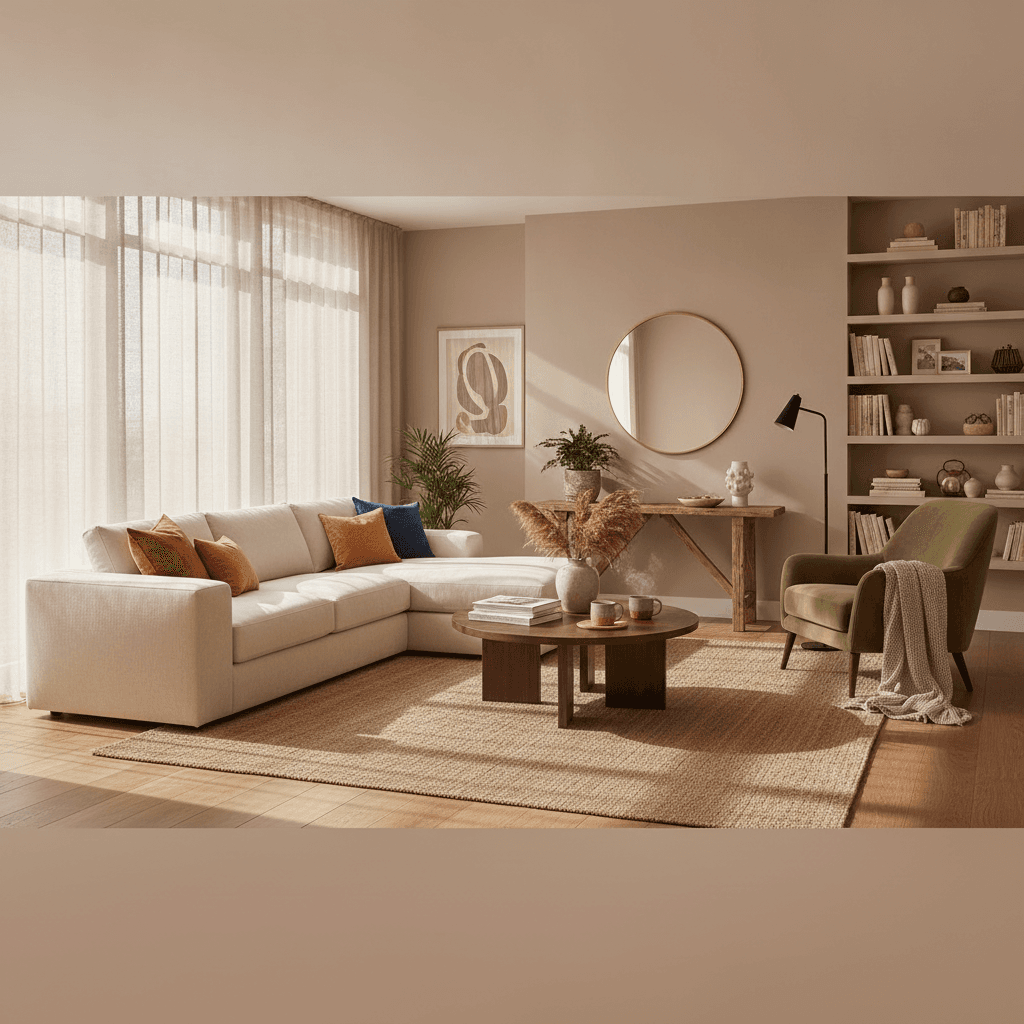
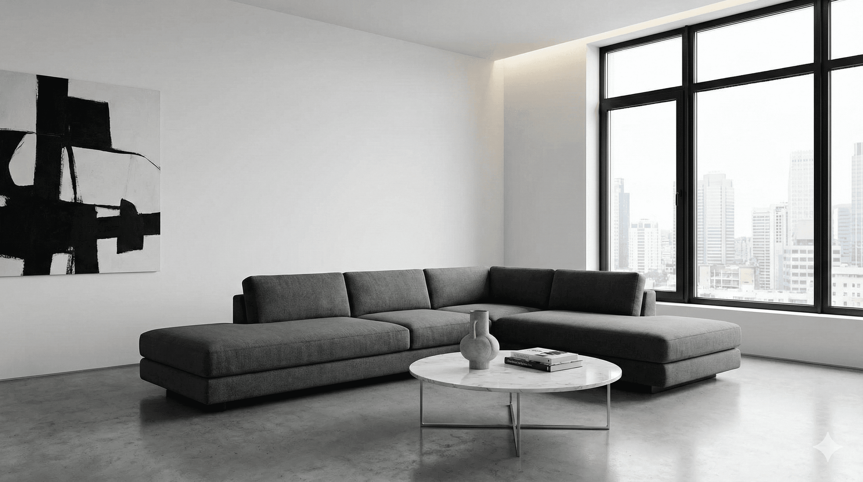
- Neutrals (Grays, Beiges, Whites, Creams): The unsung heroes of interior design, neutrals provide a versatile backdrop that allows other elements to shine. They create a sense of balance, sophistication, and timelessness. A light gray wall provides a perfect canvas for bold artwork or colorful furniture, while a creamy beige offers understated elegance.
- Dark Colors (Deep Blues, Charcoals, Forest Greens): Used thoughtfully, dark colors can add drama, depth, and luxury. They can make a large room feel more intimate and grounding. A deep navy accent wall with gold accents can feel incredibly chic and upscale.
Consider the primary function of your living room. Is it a lively entertainment zone? A cozy reading nook? A formal reception area? Your desired mood should heavily influence your color choices.
Understanding Color Theory Basics for Your Living Room
To master living room color schemes and combinations, a basic grasp of color theory is invaluable. The color wheel is your fundamental tool, illustrating the relationships between primary, secondary, and tertiary colors.
- Primary Colors: Red, Yellow, Blue – the foundation.
- Secondary Colors: Orange (Red + Yellow), Green (Yellow + Blue), Purple (Blue + Red).
- Tertiary Colors: Combinations of a primary and a secondary color (e.g., Red-Orange, Yellow-Green).
Beyond the wheel, think about:
- Hue: The pure color itself (e.g., blue).
- Saturation: The intensity or purity of the color (e.g., a vibrant blue vs. a muted blue).
- Value/Lightness: How light or dark a color is (e.g., sky blue vs. navy blue).
- Temperature: Warm vs. Cool.
These elements combine to create the infinite variations we perceive.
Essential Living Room Color Schemes & Combinations Explained
Now, let's explore the fundamental color schemes that form the backbone of successful interior design. Understanding these will empower you to create harmonious and visually appealing living spaces.
Monochromatic Harmony
This scheme uses variations in lightness and saturation of a single hue. Think deep navy, accented with a lighter sky blue, and touches of almost white-blue. It's elegant, sophisticated, and inherently cohesive.
- Example: A living room with walls painted in a soft dove gray, a charcoal gray sofa, light gray curtains, and silver metallic accents. The different shades of gray create depth without introducing new colors.
- Best For: Creating a serene, sophisticated, and minimalist feel. It's excellent for smaller spaces as it avoids visual clutter.
Analogous Allure
Analogous schemes use colors that are next to each other on the color wheel, typically two to four hues. They share a common undertone, creating a sense of calm and natural flow.
- Example: A living room featuring sage green walls, a deep teal sofa, and mustard yellow accent pillows. These colors flow seamlessly, reminiscent of a natural landscape.
- Best For: Creating a serene, harmonious, and inviting space with a bit more visual interest than a monochromatic scheme.
Complementary Contrast
Complementary colors are directly opposite each other on the color wheel (e.g., red and green, blue and orange, yellow and purple). This scheme offers high contrast and visual dynamism. To use it successfully, choose one color as dominant and use the other as an accent.
- Example: A living room with soft blue-gray walls, an off-white sofa, and vibrant orange throw pillows and a piece of abstract art with orange elements. The orange provides a striking pop against the blue.
- Best For: Creating energy, drama, and a bold statement. Requires careful balance to avoid overwhelming the eye.
Triadic Thrills
A triadic scheme uses three colors equally spaced around the color wheel (e.g., red, yellow, and blue). This creates a vibrant, playful, and energetic feel. Like complementary schemes, balance is key – let one color dominate and use the others as accents.
- Example: A white living room with a royal blue armchair, a sunny yellow ottoman, and abstract art featuring pops of red. This creates a cheerful, youthful atmosphere.
- Best For: Infusing a room with energy and playfulness. It's often seen in children's spaces but can be sophisticated when hues are muted or one color strongly dominates.
Here's a quick comparison of these fundamental schemes:
| Color Scheme | Characteristics | Mood Created | Ideal Usage |
|---|---|---|---|
| Monochromatic | Variations of a single hue (lightness, saturation) | Calm, elegant, sophisticated, harmonious | Bedrooms, minimalist living rooms, small spaces |
| Analogous | 2-4 adjacent colors on the wheel | Serene, natural, flowing, harmonious | Living rooms, cozy nooks, spaces needing gentle transitions |
| Complementary | Two opposite colors on the wheel | Dynamic, energetic, bold, high contrast | Accent walls, dramatic focal points, lively spaces |
| Triadic | Three equally spaced colors on the wheel | Vibrant, playful, energetic, balanced (if done right) | Eclectic styles, children's rooms, creative spaces |
Popular Living Room Color Palettes by Style
Different interior design styles naturally lend themselves to particular living room color schemes and combinations. Understanding these can help you align your color choices with your overall aesthetic vision. If you're looking for inspiration, Roomellow can help you explore various styles by uploading your room photo and seeing instant transformations.
Modern & Minimalist
- Colors: Grays (charcoal, slate, light gray), whites (off-white, stark white), blacks, muted blues, forest greens. Often punctuated by a single, bold accent color like mustard yellow or deep orange.
- Example Palette: Warm gray walls, a clean white modular sofa, black metal accents, and a deep sapphire blue rug.
- Why it works: Emphasizes clean lines, functionality, and uncluttered spaces. Colors are typically desaturated to maintain a calm, sophisticated feel. Explore more modern style designs.
Scandinavian Serenity
- Colors: Crisp whites, warm grays, soft beiges, light blues, muted greens, natural wood tones.
- Example Palette: White walls, light oak flooring, a comfortable gray fabric sofa, and pops of pale mint green and warm beige in textiles.
- Why it works: Focuses on natural light, coziness (hygge), and simplicity. Colors are bright and airy to maximize light, especially in regions with shorter daylight hours. Discover more about Scandinavian design.
Bohemian Bliss
- Colors: Earth tones (terracotta, olive green, sandy beige), jewel tones (emerald, ruby, sapphire), rich golds, deep oranges, vibrant purples. Often a mix of patterns and textures.
- Example Palette: Creamy white walls as a base, layered with a deep teal rug, a mustard yellow velvet armchair, and various patterned pillows in reds, oranges, and purples.
- Why it works: Celebrates individuality, global influences, and a collected, eclectic feel. Colors are often rich and inviting, reflecting diverse cultures and natural elements. Get inspired with bohemian decor ideas.
Mid-Century Modern Vibes
- Colors: Teals, olives, oranges, mustard yellows, walnuts, charcoals, and creams. Often a combination of vibrant and earthy tones.
- Example Palette: White walls, a warm walnut credenza, a vibrant orange sofa, and accent pillows in olive green and teal.
- Why it works: Reflects the era's optimism and innovation with bold, sophisticated colors, often paired with sleek wood finishes and iconic furniture shapes. Dive deeper into mid-century modern living room ideas.
Farmhouse Charm
- Colors: Whites (distressed white, shiplap white), creams, light grays, muted blues, sage greens, natural wood, and black accents.
- Example Palette: Off-white shiplap walls, a distressed wood coffee table, a large cozy sofa in a light gray linen, and accents of faded denim blue and galvanized metal.
- Why it works: Evokes a sense of rustic comfort, warmth, and simplicity. Colors are soft, natural, and often weathered, creating a welcoming and unpretentious atmosphere. Compare this to modern vs. farmhouse interior design.
| Style | Dominant Colors | Accent Colors | Key Characteristics |
|---|---|---|---|
| Modern/Minimalist | Grays, Whites, Blacks | Muted Blues, Forest Greens, Bold Singles | Clean lines, functionality, uncluttered |
| Scandinavian | Whites, Warm Grays, Light Woods | Pale Blues, Muted Greens, Soft Beiges | Bright, airy, cozy, natural light focused |
| Bohemian | Earth Tones (Terracotta, Olive), Jewel Tones | Vibrant Reds, Oranges, Golds, Purples | Eclectic, global, layered textures, free-spirited |
| Mid-Century Modern | Teals, Olives, Oranges, Mustard Yellows | Walnuts, Charcoals, Creams | Sleek, optimistic, iconic shapes, sophisticated retro |
| Farmhouse | Whites, Creams, Light Grays | Muted Blues, Sage Greens, Natural Woods, Black | Rustic comfort, warmth, simplicity, weathered finishes |
Practical Tips for Choosing Your Living Room Colors
Selecting the perfect living room color schemes and combinations requires more than just knowing what looks good in a magazine. It involves considering your specific space and needs.
1. Start with an Inspiration Point
Don't stare at a blank wall. Look for inspiration in a favorite piece of art, a patterned rug, a beloved throw pillow, or even a piece of clothing. These items often contain a palette you're already drawn to. For example, if you have a vibrant bohemian style rug with deep reds, oranges, and blues, build your scheme around those dominant hues.
2. Consider Existing Elements
You might not be starting from scratch. Take into account your flooring (hardwood, carpet, tile), permanent fixtures (fireplace stone, built-in shelving), and any existing furniture you plan to keep, like your sofa. These fixed elements provide a base for your new color palette. A richly toned hardwood floor might call for cooler wall colors to balance it out.
3. Harness the Power of the 60-30-10 Rule
This classic design principle is an excellent guideline for balancing your colors:
- 60% Dominant Color: This is your main color, typically on walls, large rugs, or major furniture pieces. It sets the overall mood.
- 30% Secondary Color: This color supports the dominant color and is used for items like curtains, accent furniture (e.g., an armchair), or bedding.
- 10% Accent Color: This pop of color provides contrast and visual interest. Think throw pillows, decorative objects, artwork, or fresh flowers.
For instance, a living room might have 60% soft beige walls, 30% a deep navy sofa and curtains, and 10% golden yellow cushions and a ceramic vase.
4. Test, Test, Test!
Never commit to a color based solely on a paint chip. Colors look drastically different in varying light conditions. Paint large swatches directly on your wall or on poster board and observe them throughout the day and evening. Pay attention to how natural light changes the hue, and how it appears under artificial lighting. Roomellow can help you visualize these colors in your actual space with your furniture.
5. Don't Forget Texture and Finish
Color isn't just about hue; it's also about how light interacts with the surface. A matte wall paint will absorb light, making a color appear softer, while a glossy finish will reflect light, making it seem more vibrant. Similarly, velvet will deepen a color, while linen will soften it. Mixing textures, even within a monochromatic scheme, adds depth and interest. For example, a minimalist living room might use smooth polished concrete, soft wool rugs, and sleek leather.
6. Adjust for Room Size and Natural Light
- Small Living Rooms: Lighter, cooler colors (e.g., pale blues, soft greens, off-whites) make a small living room feel more expansive and open. Keep patterns minimal and scale furniture appropriately.
- Large Living Rooms: You have more freedom here. Darker, warmer colors (e.g., deep charcoals, rich plums, terracotta) can make a large, open-plan space feel cozier and more intimate. You can also experiment more with bold patterns and textures.
- North-Facing Rooms: Tend to get cooler, indirect light. Warmer colors with yellow or red undertones (e.g., creamy whites, warm grays, soft yellows) can help brighten and warm up the space.
- South-Facing Rooms: Receive abundant, bright, warm light. Cooler colors (e.g., blues, greens, cool grays) can help balance the warmth and prevent the room from feeling too hot.
| Factor | Impact on Color Choice | Example Application |
|---|---|---|
| Room Size | Light/Cool for small; Dark/Warm for large | Small living room: Pale blue walls, light gray sofa. Large living room: Deep olive accent wall. |
| Natural Light | North-facing: Warm up; South-facing: Cool down | North room: Creamy white walls. South room: Cool gray or soft teal walls. |
| Existing Furniture | Integrate with existing pieces or provide contrast | If you have a red leather sofa, choose neutral walls with green accents. |
| Flooring | Complement or contrast with floor's undertones | Dark wood floor: Lighter, brighter wall colors. Light carpet: Deeper wall colors for contrast. |
| Desired Mood | Calm (cool), Energetic (warm), Sophisticated (monochromatic) | Home office: Calming blues/greens. Entertainment room: Lively yellows/oranges. |
Bringing Your Vision to Life with Roomellow
Visualizing living room color schemes and combinations before committing to paint and furniture can be incredibly challenging. This is where Roomellow truly shines. Instead of endless paint swatches and guesswork, you can simply upload a photo of your living room to our platform.
Our AI will instantly generate design ideas, allowing you to experiment with different wall colors, furniture styles (from modern to farmhouse), and accessories – all with real, purchasable furniture from furniture stores. Want to see how a charcoal gray sofa looks against a sage green wall with a bright yellow accent chair? Roomellow shows you in seconds. It's an invaluable tool for exploring palettes and ensuring your chosen colors harmonize with your furniture and overall aesthetic. You can test out various AI interior design tips without ever picking up a paintbrush.
FAQ: Living Room Color Schemes & Combinations
How do I choose a main living room color?
Start by considering the mood you want to create (calm, energetic, cozy, elegant). Look at your existing fixed elements like flooring and natural light. Then, consider a color you genuinely love and that makes you feel good. Use the 60-30-10 rule to ensure it's balanced with secondary and accent colors. Roomellow can help you test out different dominant colors on your walls.
Can I mix warm and cool colors in my living room?
Absolutely! Mixing warm and cool colors creates depth and balance, preventing a room from feeling one-dimensional. The key is balance. You might have predominantly cool walls and a sofa, then introduce warmth through wood tones, a vibrant throw blanket, or artwork with warm hues. Conversely, a warm room can be cooled down with touches of blue or green.
What's the best color for a small living room?
For small living rooms, lighter, cooler colors are generally recommended. Pale blues, soft greens, light grays, and crisp whites make a space feel more open and airy. Using a monochromatic or analogous scheme with light colors can further enhance the feeling of spaciousness.
How important is lighting in color choice?
Lighting is extremely important. Natural light (from windows) changes throughout the day, affecting how colors appear. Artificial lighting (warm or cool bulbs) also plays a significant role. Always test paint swatches in your room at different times of day and under your actual light fixtures to see how the color truly behaves before making a final decision.
Ready to redesign your room?
Upload a photo of your room and get a professional AI redesign with real furniture you can buy. Free to try — no credit card required.
Try Roomellow freeChoosing the perfect living room color schemes and combinations is a journey of discovery. By understanding color theory, drawing inspiration from various styles, and applying practical tips, you can create a space that not only looks beautiful but also feels uniquely yours. With tools like Roomellow, that journey becomes even more exciting and accessible, allowing you to visualize your dream living room before it even begins.