Mastering Furniture Color: Expert Tips for a Cohesive Home
Struggling to choose the perfect furniture color? Our expert guide helps you understand color interaction, light, and lifestyle for a cohesive home. Make confident furniture color choices today!
By Roomellow Team
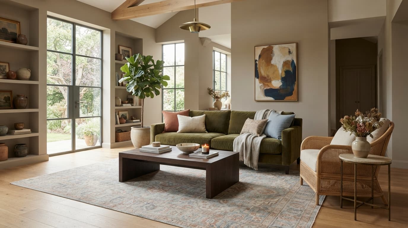
Choosing furniture color is one of those design decisions that feels both incredibly exciting and utterly paralyzing. You scroll through endless inspiration photos, see a gorgeous sage green sofa, and think, "Yes, that's it!" Then you imagine it in your living room, next to your existing beige walls and oak floors, and suddenly it looks… less gorgeous. Flat. Out of place.
We’ve all been there. The truth is, selecting the right furniture color isn't about picking your favorite hue from the rainbow. It's about understanding how colors interact with each other, with the light in your room, and most importantly, with your lifestyle. It’s about building a cohesive story, layer by layer, starting with the biggest pieces and working your way down to the smallest accents. Our goal here isn't just to tell you what colors to pick, but to help you understand why certain colors work, so you can make confident, informed choices that truly transform your space.
Understand Your Room's Existing Canvas
Before you even think about that dream sofa in emerald green or a pair of creamy white accent chairs, you need to assess the foundation you're working with. This means looking at the non-negotiables – the things that are either too expensive or too difficult to change right now.
Existing Colors and Undertones
Take a good, hard look at your walls, flooring, and any large, immovable built-ins.
- Walls: Are they painted? What's the shade? More importantly, what are their undertones? A "greige" paint might lean warm (yellow/brown undertones) or cool (blue/purple undertones). A supposedly "white" wall can appear stark white, creamy, or even slightly blue depending on the pigments.
- Flooring: Do you have warm-toned hardwood (like red oak or cherry), cooler-toned wood (like white oak or ash), or carpet? What color is the carpet? Tile? All these elements contribute to the existing color palette.
- Built-ins/Trim: If you have dark wood built-ins, a brick fireplace, or specific trim colors, these are part of your fixed color scheme.
Our take: grab a few large paint swatches (or even just white printer paper) and hold them up against your walls and floors. This helps neutralize your perception and makes those undertones pop. If your walls are a warm beige with yellow undertones, introducing a very cool-toned gray sofa without careful consideration might make the room feel disjointed. It's not impossible to mix warm and cool, but it requires a strategic approach, which we'll get to.
Natural Light vs. Artificial Light
Light is a color's best friend and worst enemy.
- North-facing rooms tend to have cooler, softer light. Colors can appear muted or even slightly grayed out.
- South-facing rooms get bright, warm light all day. This can intensify colors, making them feel more vibrant.
- East-facing rooms get bright morning light, then cooler light in the afternoon.
- West-facing rooms get warm, intense afternoon light.
Think about the time of day you use the room most. That sage green sofa might look perfect in the morning sun, but under the cooler light of a north-facing window in the evening, it could read as a murky gray-green. Artificial lighting plays a huge role too. Warm white bulbs (around 2700K-3000K) will make colors feel cozier, while cooler white bulbs (3500K-5000K) will make them appear crisper and potentially brighter. Always test a fabric swatch in your actual room, at different times of day.
Room Size and Ceiling Height
Color choice can visually alter perception.
- Smaller rooms: Lighter, neutral colors often make a small room feel more expansive and open. A pale gray sofa, for instance, reflects light, making the space feel airier. Dark, heavy furniture colors can sometimes overwhelm a small space, making it feel cramped, but used strategically (like a single, deep-toned accent chair), they can add depth without consuming the room. You can also play with techniques to make a small room look bigger using color.
- Larger rooms: You have more freedom here. Darker, more saturated colors can create intimacy and ground a large, open-concept space. A deep navy sectional or a rich forest green velvet sofa can define a seating area beautifully in a generous living room.
The Psychology of Furniture Color: What Are You Trying to Say?
Every color carries an emotional weight. Understanding this can help you pick furniture that not only looks good but also feels good in your space.
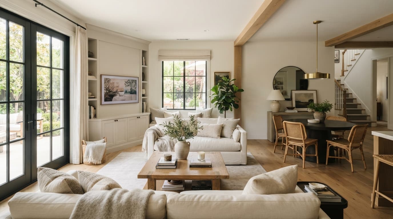
Neutrals: The Grounding Force (Grays, Beiges, Whites, Creams)
These are the workhorses of interior design, and for good reason.
- Pros: Versatile, timeless, easy to pair with almost any accent color, create a calm and sophisticated backdrop, great for resale value. They allow artwork, accessories, and accent pieces to truly shine.
- Cons: Can sometimes feel bland or uninspired if not layered with texture and varying shades.
- Our take: Don't dismiss neutrals as boring. A perfectly tailored oatmeal linen sofa (like the Sven from Article, typically $1800-$3000 depending on size) can be incredibly chic. It’s a smart choice for your biggest investment pieces, like your sofa or bed frame, because trends come and go, but a well-chosen neutral endures. Think about varying shades – a light cream sofa, a medium gray rug, and a darker wood coffee table still create visual interest within a neutral palette.
Warm Tones: Energy and Comfort (Oranges, Reds, Yellows, Browns)
These colors are vibrant and inviting, often associated with warmth and passion.
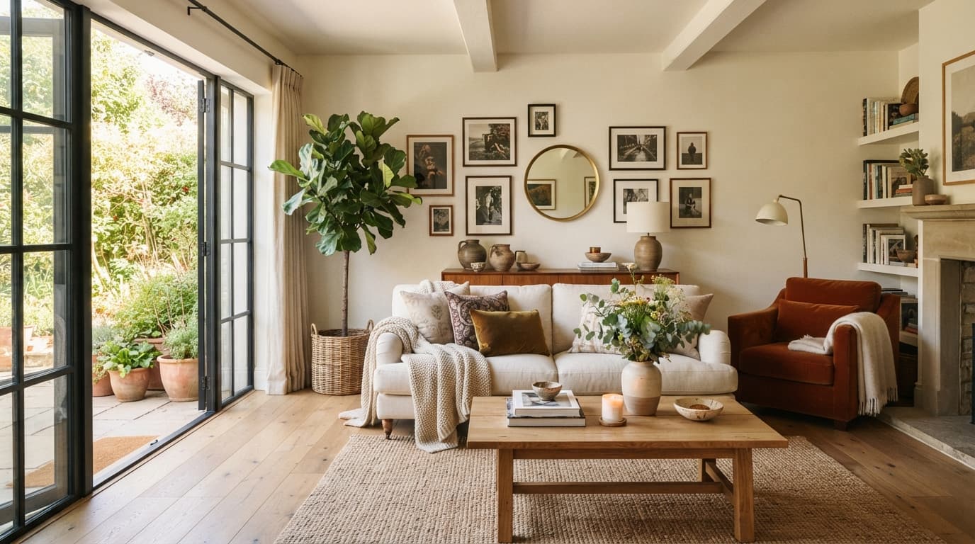
- Pros: Instantly make a room feel cozier and more energetic, stimulate conversation, add personality. A burnt orange velvet armchair (like the Ceni from Joybird, often $1000-$1500) can be a stunning focal point.
- Cons: Can be overwhelming if overused, may make a room feel smaller, can clash if undertones aren't carefully matched.
- When to use: Ideal for living rooms, dining rooms, or spaces where you want to encourage interaction and warmth. Avoid in bedrooms if you're aiming for extreme tranquility.
Cool Tones: Calm and Sophistication (Blues, Greens, Purples)
Cool colors evoke a sense of serenity, spaciousness, and elegance.
- Pros: Create a calming atmosphere, make rooms feel larger and airier, can feel refreshing and sophisticated. A deep emerald green sofa or a serene sky blue armchair can be incredibly grounding.
- Cons: Can sometimes feel cold or sterile if not balanced with warmer elements (wood, metallics, soft textures).
- When to use: Perfect for bedrooms, bathrooms, and home offices where relaxation and focus are key. A deep navy sofa (like the Kova from Albany Park, around $2000-$4000) can add a sophisticated touch to a modern living room.
Dark Tones: Drama and Grounding (Charcoal, Navy, Deep Green, Black)
Using dark colors in furniture can be a bold and impactful choice.
- Pros: Creates a sense of drama and intimacy, grounds a space, hides imperfections and stains well (especially useful for busy households).
- Cons: Can make a small room feel even smaller if not balanced with light walls and accessories; requires good lighting to avoid feeling cave-like.
- Our take: Don't shy away from a deep charcoal sofa. It's surprisingly versatile and acts as a fantastic anchor. Pair it with light-colored pillows, a sheepskin throw, and warm wood accents to keep it from feeling too stark.
The 60-30-10 Rule for Furniture Color
You’ve probably heard of the 60-30-10 rule for interior design, but it’s particularly useful when it comes to furniture color. It’s not a hard-and-fast law, but a helpful guideline to achieve balance.
- 60% Dominant Color: This is the primary color of your room, often your wall color, and typically includes your largest furniture piece, like a sofa or large area rug. For example, if your walls are a light beige, your sofa might be a slightly darker taupe or a creamy off-white. This is where you want timelessness and versatility. If your living room is primarily neutral, this 60% might be split between your light grey walls and a medium grey sectional.
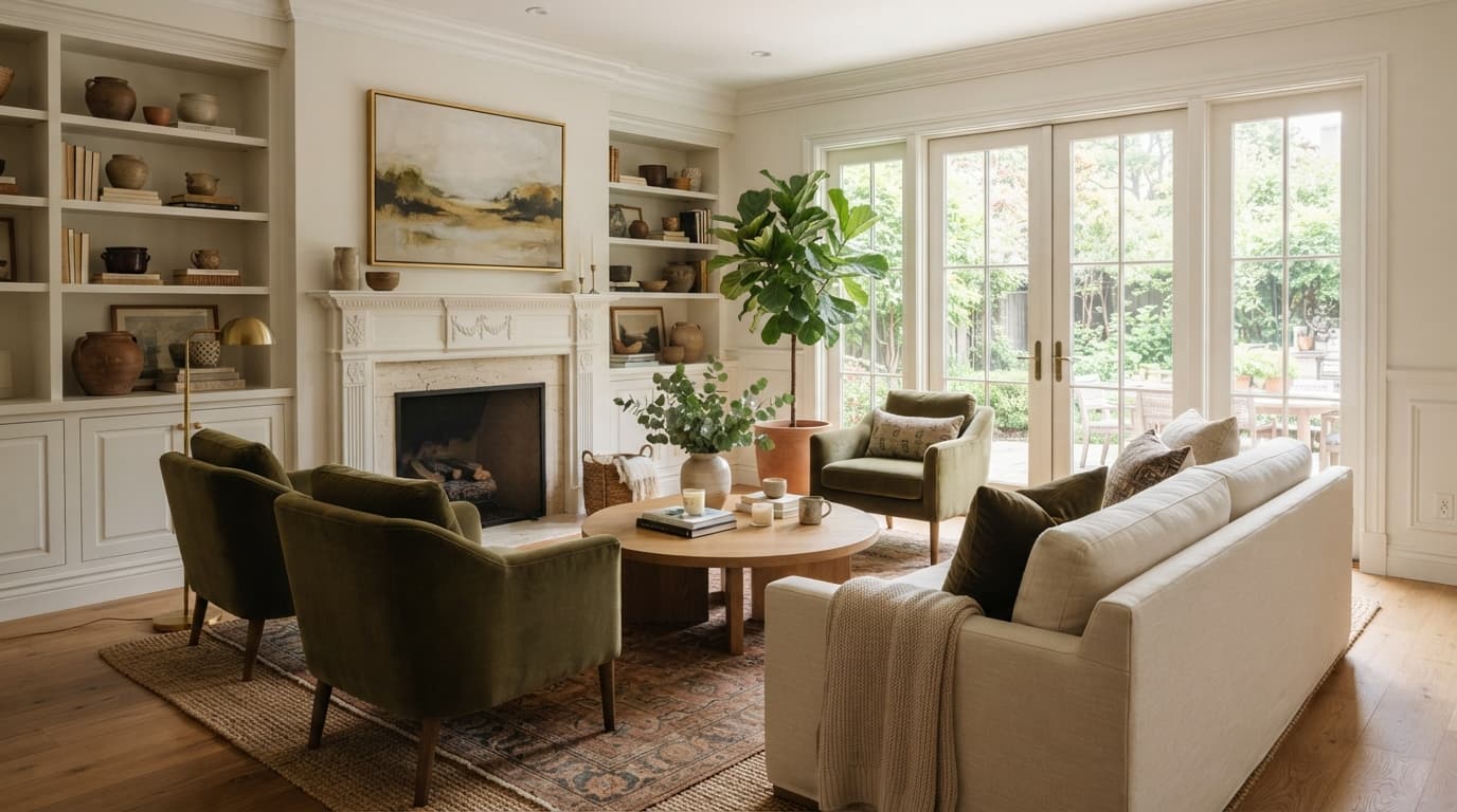
- 30% Secondary Color: This color supports the dominant color and provides contrast. Think accent chairs, drapes, a significant portion of your area rug, or even a large bookcase. If your sofa is neutral, this is an excellent place to introduce a bit more personality – maybe a pair of olive green velvet armchairs or a rich leather recliner (like the Article Sven Charme Tan leather armchair, around $1000).
- 10% Accent Color: This is where you really have fun and introduce pops of vibrant color or dramatic contrast. Think throw pillows, blankets, decorative objects, artwork, or small accent stools. These are low-commitment items, so you can easily swap them out when your mood or the season changes.
We find this rule incredibly freeing because it gives you a structure without stifling creativity. It stops you from going overboard with too many competing colors on your big-ticket items.
Choosing Large Upholstered Pieces: Sofas and Sectionals
This is usually your biggest furniture investment, both in terms of money and visual impact. Make this choice carefully.
Durability and Practicality
Before aesthetics, consider your lifestyle.
- Kids and Pets: Light-colored linen or delicate bouclé might look fantastic on Instagram, but in real life, a spill or muddy paw print will be a constant source of stress. Performance fabrics (like Sunbrella or Crypton) come in a vast array of colors, including lighter neutrals and even whites, and are much easier to clean. Alternatively, a medium-toned gray, charcoal, or even a patterned fabric will be more forgiving. We're big fans of performance velvets for families – they're luxurious, durable, and surprisingly easy to spot clean.
- Frequency of Use: A sofa in a high-traffic family room needs to withstand more than one in a rarely used formal living room.
- Our take: Bouclé looks incredible and is super on-trend, but it's a nightmare if you have pets. Trust us on this. The texture traps fur and pulls easily. If you have a furry friend, stick to tighter weaves, leather, or performance fabrics. A darker color in a durable fabric is often the wisest long-term choice for a central seating piece.
Timeless vs. Trendy
While you want your space to feel current, your main sofa isn't the place for fleeting trends.
- Timeless Colors: Grays (especially medium to dark), beiges, off-whites, navy, and classic leather tones (tan, saddle, dark brown) are always in style. They provide a neutral backdrop that allows you to update your look with smaller, less expensive items.
- Trendy Colors: A vibrant pink, electric blue, or lime green sofa might seem exciting now, but will you still love it in five years? For trendier colors, consider an accent chair or throw pillows first. If you absolutely love a bold color for your sofa, ensure the style of the sofa itself is classic enough to carry the color over time.
- Our take: We'd skip the matching sofa and loveseat set. Instead, opt for a solid, neutral sofa (like a medium grey or a classic camel leather) and pair it with a contrasting accent chair in a different color and texture. This creates visual interest and gives you more flexibility to refresh your look later. For ideas on how to mix and match, check out our guide on how to mix and match furniture.
Fabric Types and Their Color Implications
The texture and sheen of a fabric impact how a color appears.
- Linen/Cotton: Often matte, colors appear softer and more natural. Great for a relaxed, airy feel.
- Velvet: Has a rich pile that catches light, making colors appear deeper and more luxurious. A deep jewel-toned velvet (emerald, sapphire, ruby) can be absolutely stunning.
- Leather: Durable and develops a beautiful patina over time. Colors are typically warm (tan, brown) or classic (black, deep red). A good leather sofa is an investment and typically costs upwards of $2,500.
- Bouclé: Textured and looped, giving colors a softer, cozier, almost cloudy appearance. Best for low-traffic areas or for small accent pieces if you have pets.
Mixing Wood Tones and Metal Finishes
Once your main upholstered pieces are settled, you'll introduce wood and metal. These are colors too!
Warm Woods vs. Cool Woods
- Warm Woods: Oak, maple, cherry, walnut often have yellow, red, or orange undertones. They bring warmth and a classic feel.
- Cool Woods: Ash, birch, sometimes light oak, tend to have gray or very pale yellow undertones. They contribute to a more modern, minimalist, or Scandinavian aesthetic.
- Our take: Don't be afraid to mix wood tones, but aim for harmony. If your floors are a warm, red-toned oak, a cool, gray-washed wood coffee table might feel jarring. Instead, choose a walnut coffee table (like the Castlery Seb Coffee Table, around $600-$900) to complement the warmth, or a black metal coffee table for contrast without clashing. Pick one dominant wood tone, then introduce one or two complementary secondary tones.
Metal Accents
Metal finishes are like jewelry for your room.
- Warm Metals: Brass, gold, copper. These add a touch of glamour and warmth. They pair beautifully with rich jewel tones, warm neutrals, and dark woods.
- Cool Metals: Chrome, polished nickel, silver. These are sleek and modern. They work well with cool grays, blues, and minimalist aesthetics.
- Neutral Metals: Matte black, oil-rubbed bronze. These are incredibly versatile and can bridge warm and cool palettes.
- Our take: Stick to 2-3 metal finishes in a single room to avoid visual chaos. A popular combination is brass and matte black, or chrome and matte black.
Rugs: The Unsung Hero of Color
A rug isn't just a soft landing; it's a massive color contributor, often tying all your furniture colors together.
- Anchor Your Space: A rug should be large enough to anchor your furniture. A 9x12 rug under a sectional is non-negotiable for most living rooms, allowing the front legs of all seating to rest on it. Too small, and it feels like a postage stamp.
- Introduce Pattern and Color: If your furniture is mostly neutral, a patterned rug in colors that pick up your 30% and 10% accents is a fantastic way to add interest and softness. A Persian-style rug can introduce a complex palette of reds, blues, and creams that look stunning against a simple grey sofa.
- Our take: Don't buy the rug last. It's too important. We often select the rug after the main upholstered pieces but before the accessories. It helps define the room's color story. For more detailed advice, read our guide on how to pick a rug for a living room.
Pillows, Throws, and Accessories: The Easiest Way to Experiment
This is your playground. These are the least expensive items and the easiest to change.
- Pillows: Play with different colors, patterns, and textures. If your sofa is a solid color, patterned pillows can bring life. Choose colors that relate to your rug, artwork, or secondary furniture pieces.
- Throws: A chunky knit throw in a vibrant color can add a pop, or a soft linen throw in a neutral tone can add texture.
- Decor: Vases, books, candles – these are your 10% accent. This is where you can be bold or seasonal without a huge commitment.
- Our take: We always recommend buying pillow covers, not entire pillows. They're cheaper, easier to store when not in use, and better for the environment. You can swap them out seasonally or when you want to experiment with new color trends.
Acknowledging Trade-offs & Realities
No design decision happens in a vacuum.
- Budget: A bespoke velvet sofa in a custom color might be your dream, but a ready-made performance fabric sofa from West Elm or Pottery Barn in a classic color is a more realistic choice for most. Prioritize spending on the biggest pieces in durable, timeless colors, and save experimentation for accessories.
- Maintenance: Lighter colors, especially whites and creams, demand more careful maintenance. Be honest with yourself about how much effort you're willing to put into cleaning.
- Resale Value: While you're designing for you, if you plan to move within a few years, highly specific or trendy furniture colors might limit your pool of potential buyers (or require a significant discount on your furniture if you're selling it with the house). Neutrals are generally safer.
Visualize Before You Buy with Roomellow
After all this advice, how do you really know if that deep blue sofa will work with your walls and rug? This is exactly the problem Roomellow solves. Upload a photo of your actual room and our AI redesigns it using real, purchasable furniture from the brands we support — so you're not guessing how a color reads against your walls, your floors, and your light. Test a sage sofa against a charcoal one, swap a warm rug for a cool one, and see each option in your real space before you spend a dollar. Every piece in the result is a real product you can click to buy.
Choosing furniture color doesn't have to be overwhelming. By understanding your room's existing elements, the psychology of color, and how to balance different hues, you can create a space that feels personal, beautiful, and uniquely yours.
Ready to redesign your room?
Upload a photo of your room and get a professional AI redesign with real furniture you can buy. Free to try — no credit card required.
Try Roomellow free